Pearl iZUMi
JOY OVER SUFFERING
Brand Design • Specialty Outdoor Apparel • 2025 • North America and Europe
A weather campaign gave up the respect that cycling hands out for suffering, and went looking for the rider who grins at a forecast and goes anyway.
Pearl iZUMi has made cycling apparel since 1950, when Kinji Shimizu built the brand's first jersey in Japan, and 75 years later it is one of the largest dedicated cycling companies in the world. The shoulder season inclement weather line needed a campaign, and the category already had the script memorized. Every cycling brand runs a bad weather push and they all land in the same two places, the sufferfest where the storm is a test of will, or the spec sheet where membrane ratings do the talking. Scroll the fall feed and it is the same dark, soaked, solitary rider wearing the same grim face.
CSR Lab was brought in for the creative execution–the design layer of the campaign–and the brief showed up with no belief named at the top of it. We identified it first, then built the voice accordingly.
OVERVIEW
The engagement was the design layer of the shoulder season inclement weather campaign, creative direction, type system, art direction, and the full print and digital kit, with the belief named before a single thing got designed.
One line and one color made Pearl iZUMi impossible to confuse with anyone else in a season when the whole category blurs into the same grim rider.
The rider heading out in the wet just wants to ride, and the miserable days make the best stories.
CONVICTION
Cold weather cycling creative keeps reaching for the same feeling, the set jaw, the head down against the rain, one rider alone in the dark earning it. The brief arrived with no belief under it, so we named one. The rider Pearl iZUMi cares about heads out anyway, they just want to ride, and the soaked, freezing, faintly ridiculous day is the one that turns into the best story by dinner. The forecast can't fuck with fun. Holding that costs something, because cycling saves its deepest respect for suffering, and this campaign hands that respect back on purpose, walks off the spec sheet where every rival hides, and leaves the fair weather riders and the misery tourists at the curb.
VOICE
Against that grim register, Pearl iZUMi's voice is loud, profane, and grinning, built to challenge the reader rather than comfort them. It dares you out the door, picks a fight with the forecast, and never once frowns. Where the season asks for reverence, this voice heckles. Everything below is that attitude made into a working kit.
Verbal identity
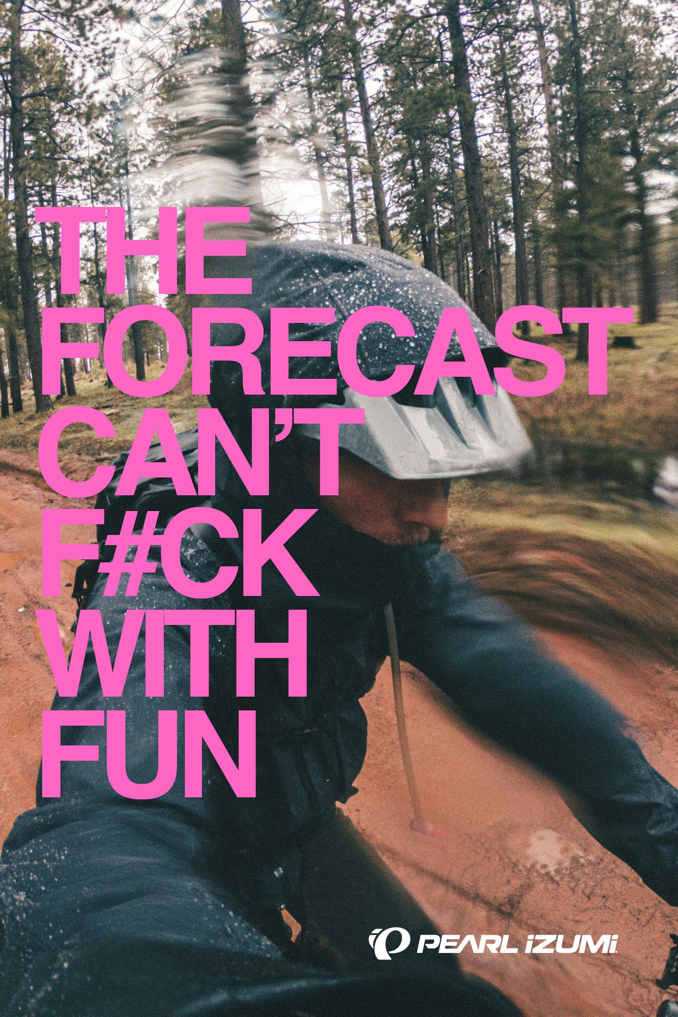
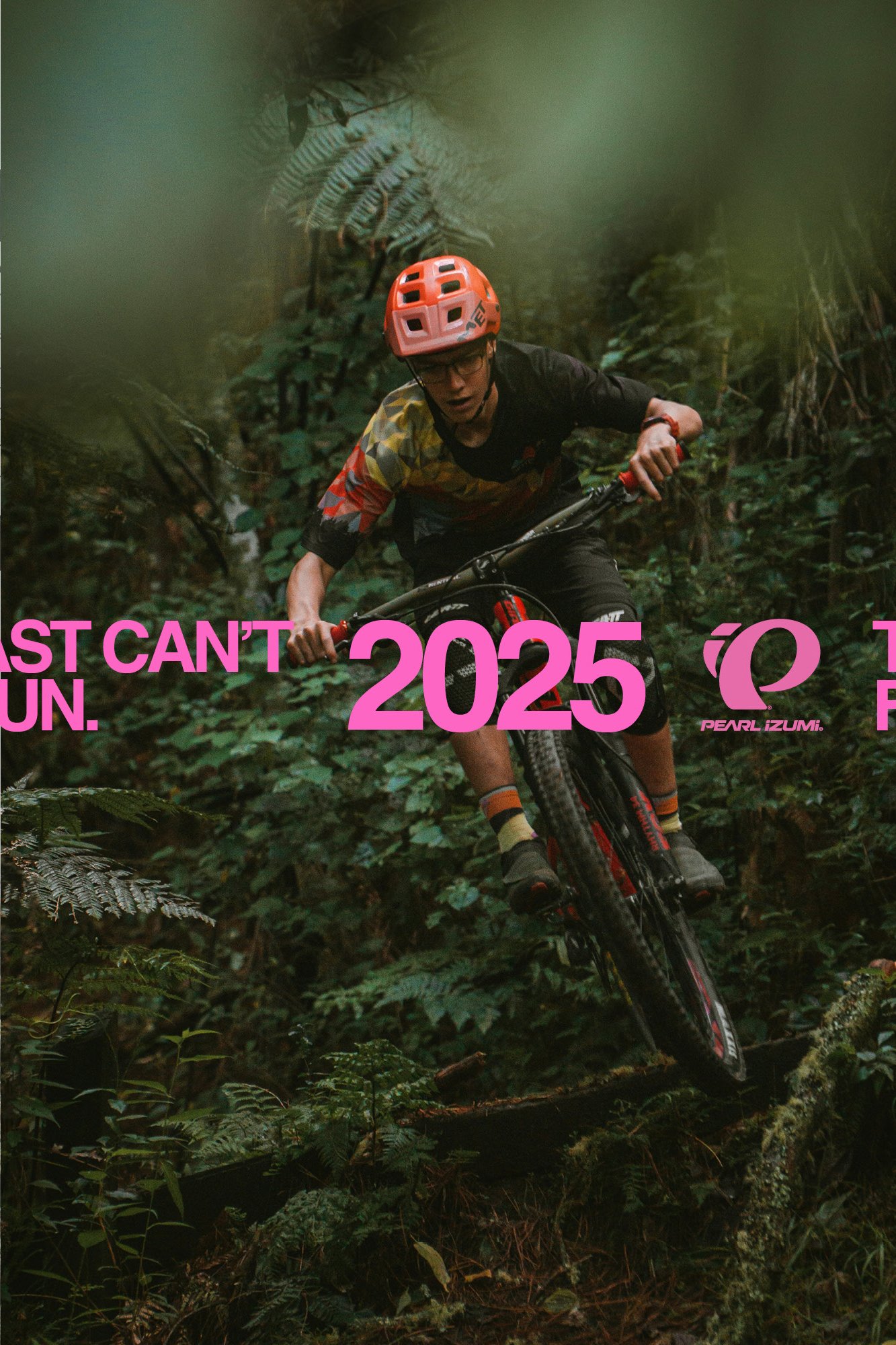
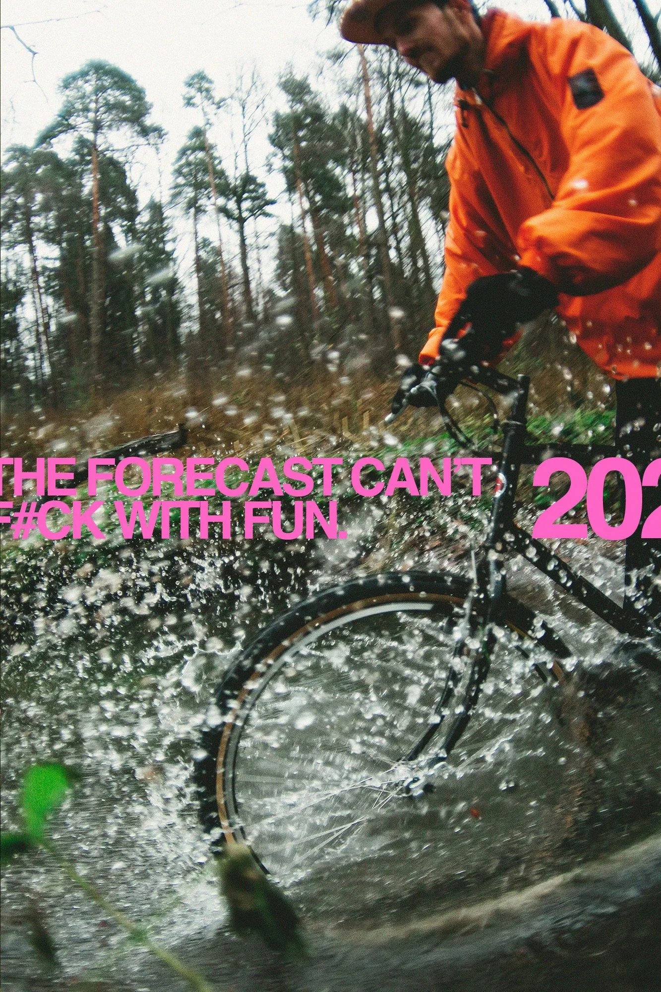
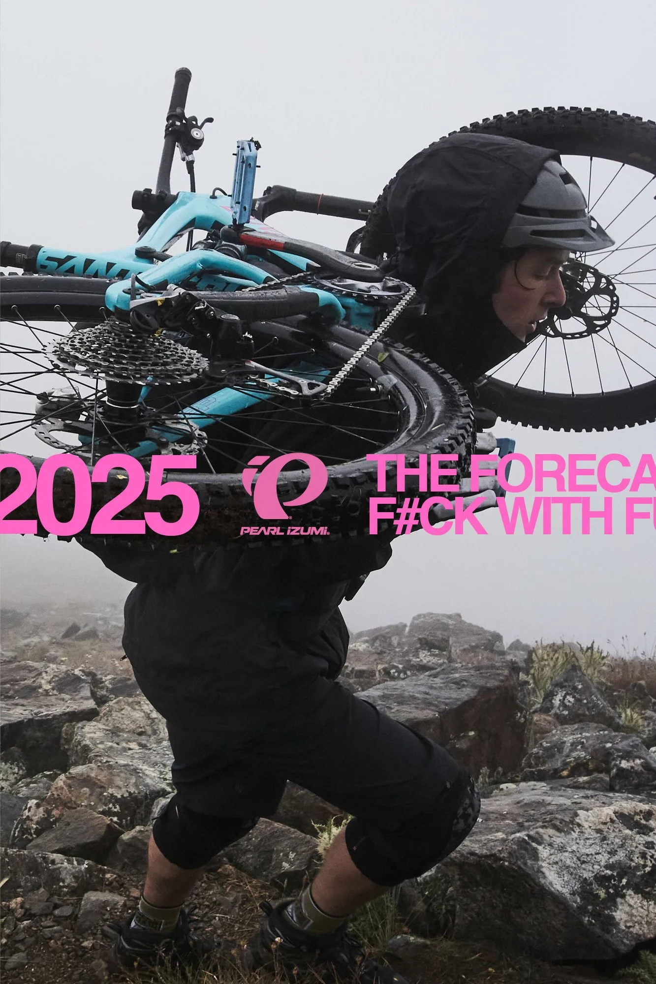
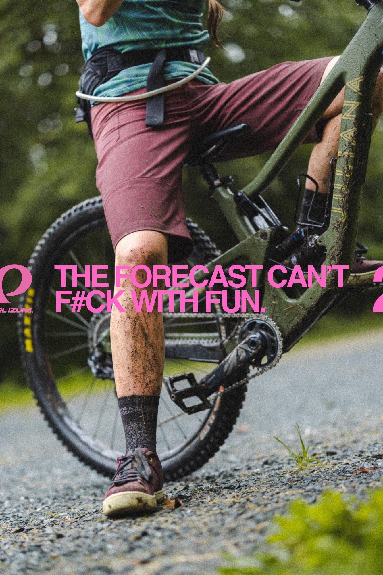
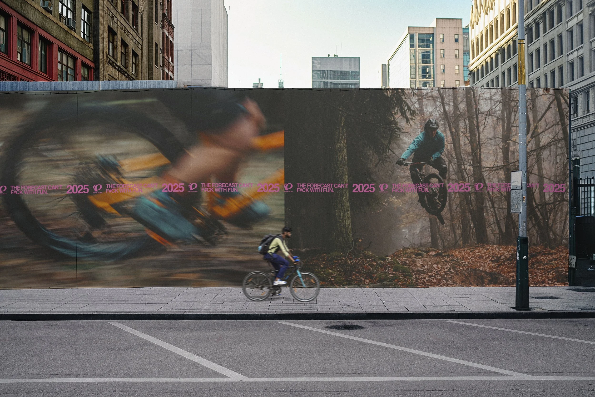
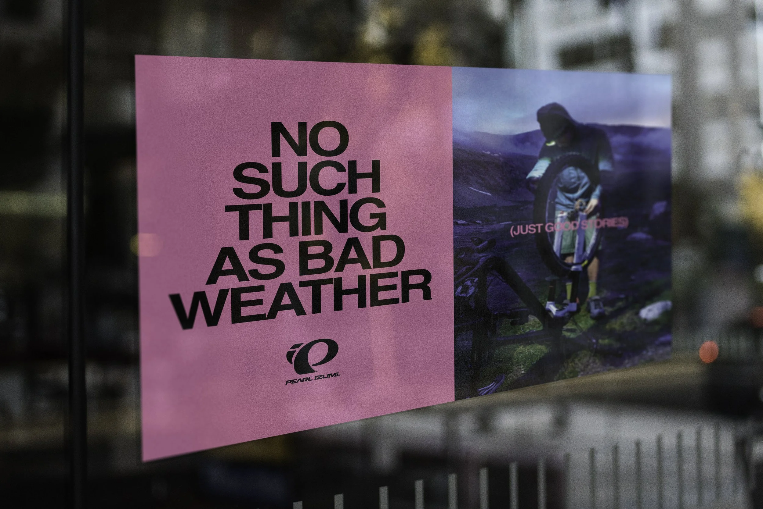
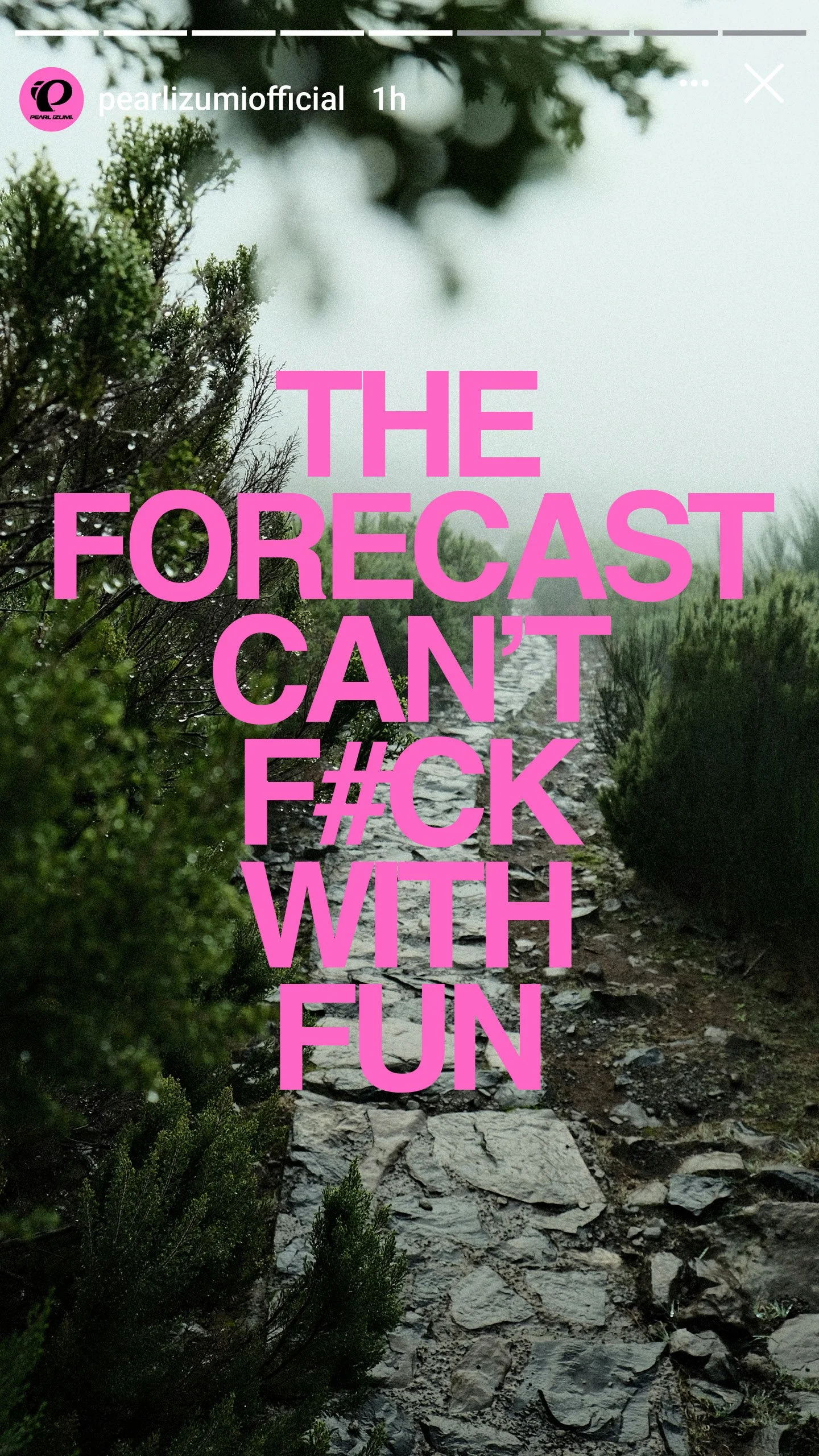
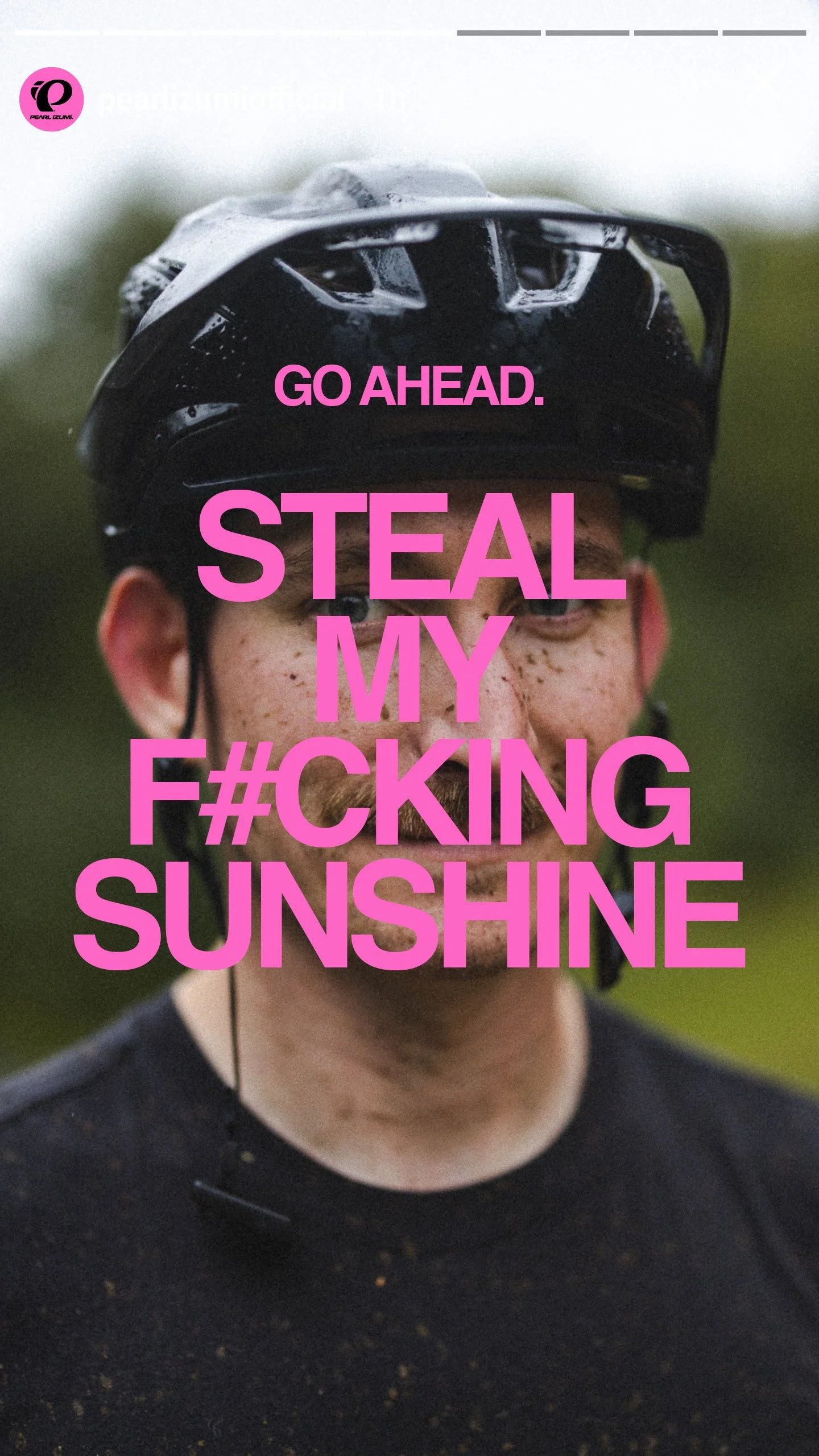
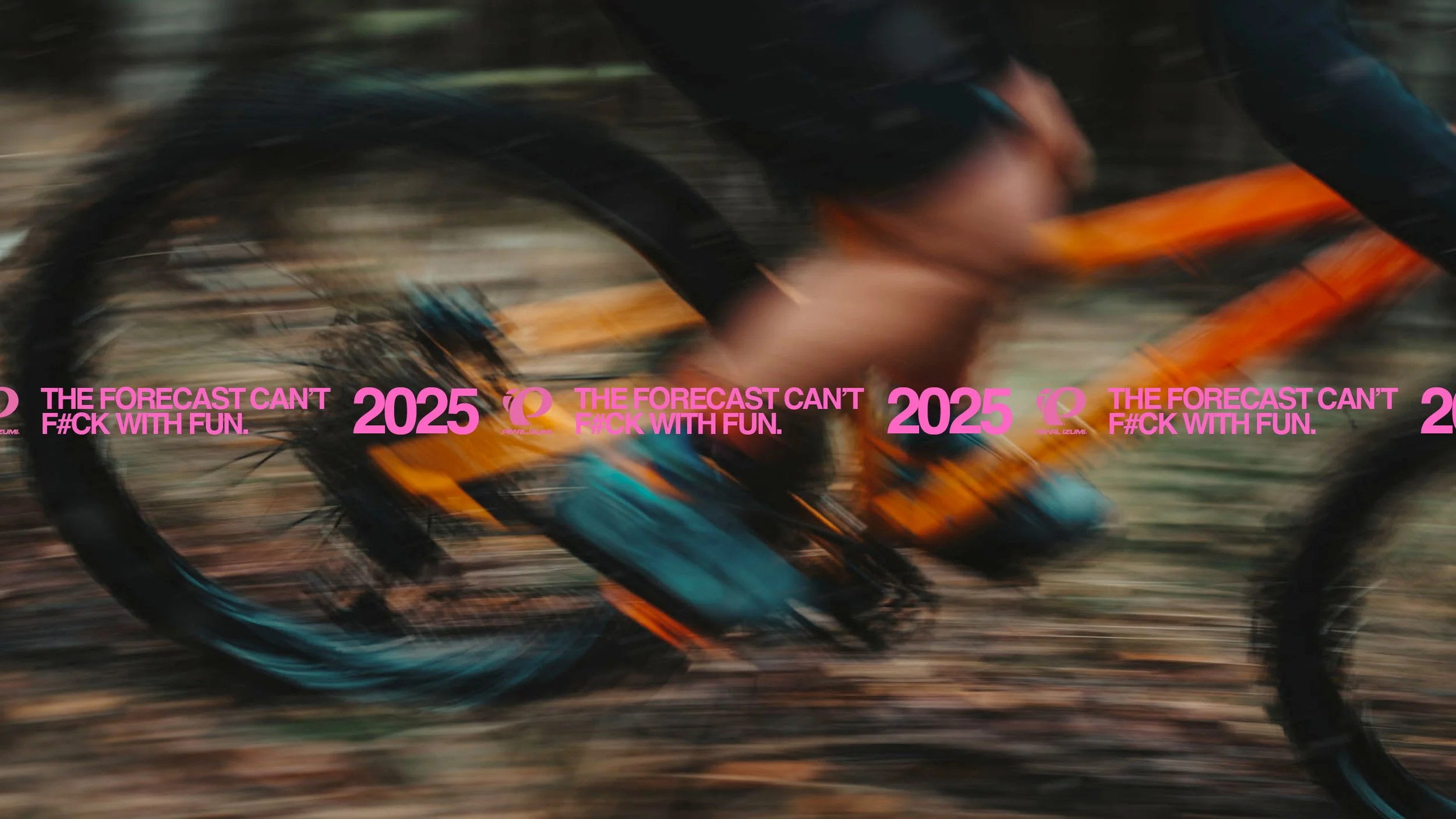
The belief became the headline, printed loud across the campaign, The Forecast Can't Fuck With Fun. From there the writing stays profane and grinning, the shitty day framed as the good one every time. The line does the positioning by itself, no membrane rating required.
Type
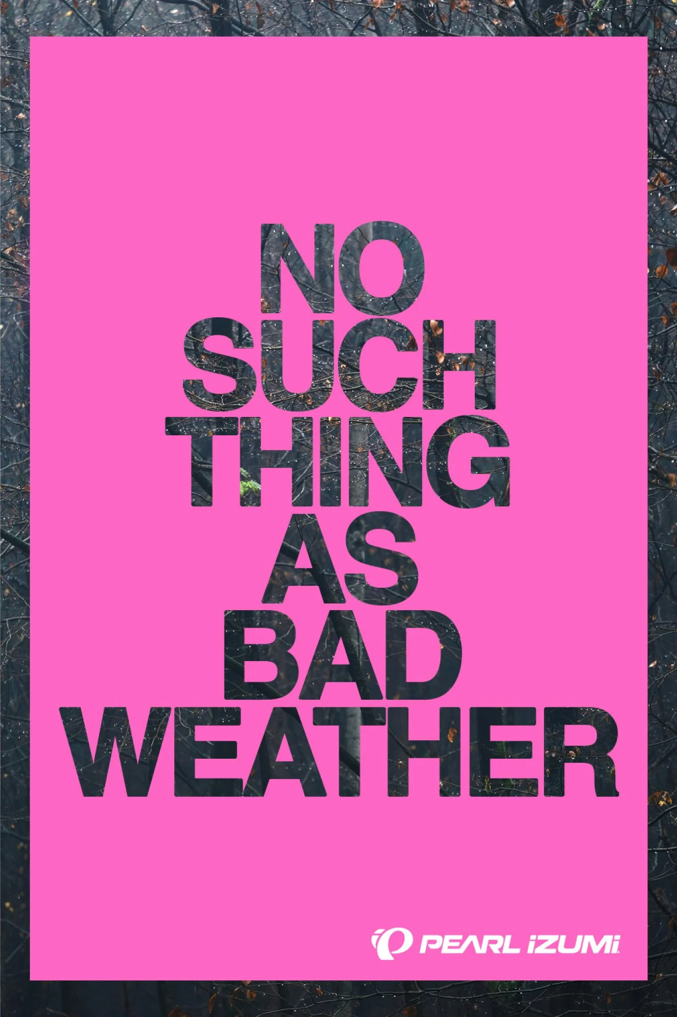
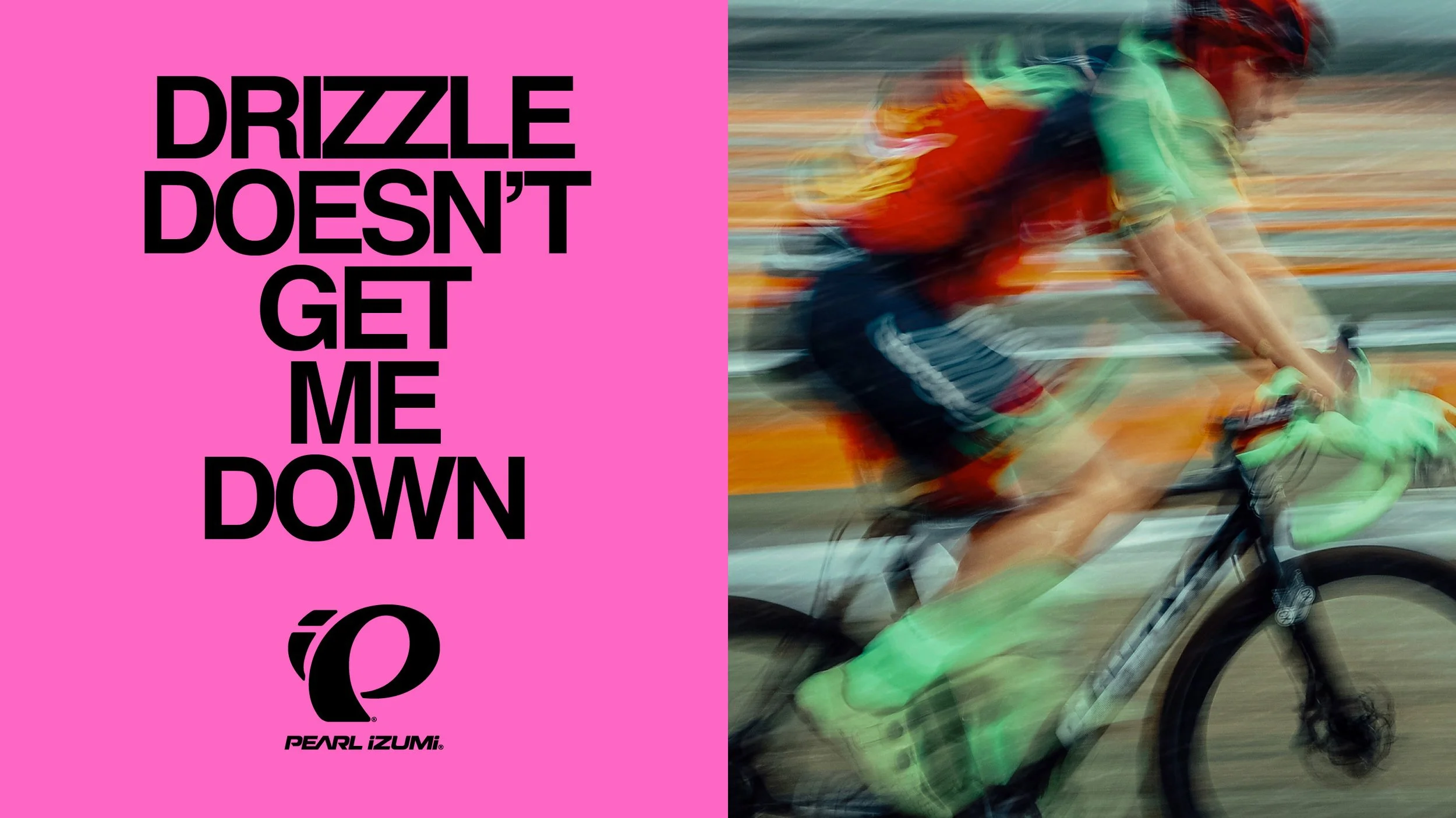
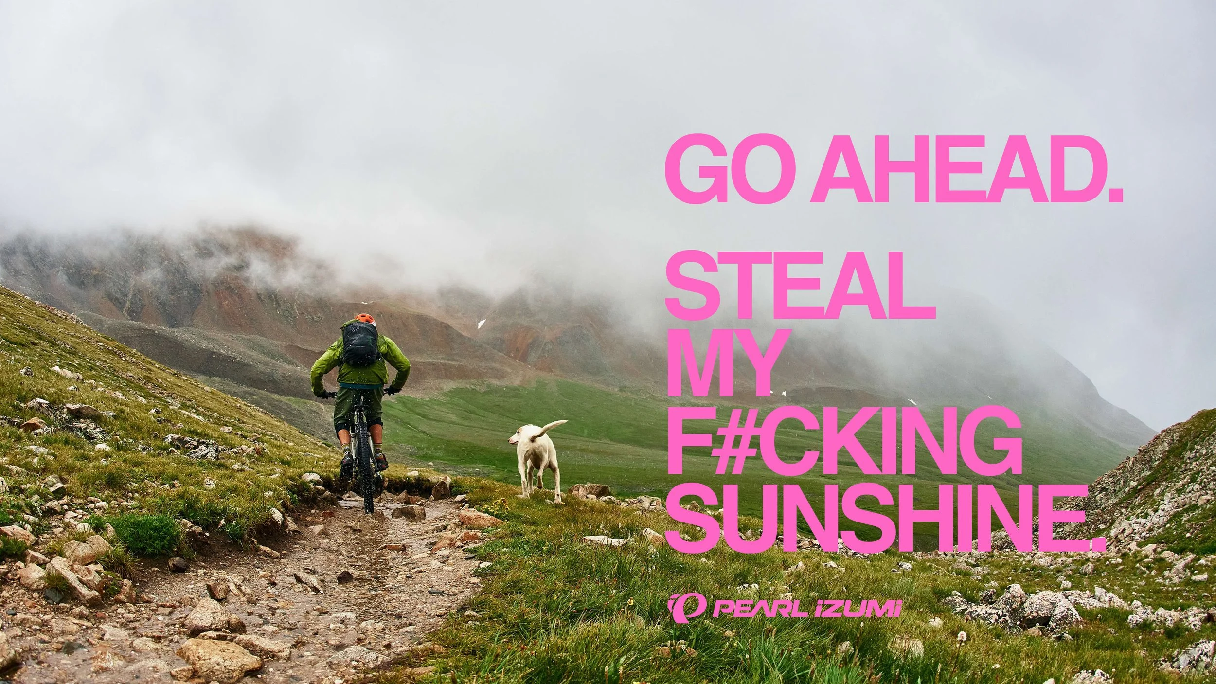
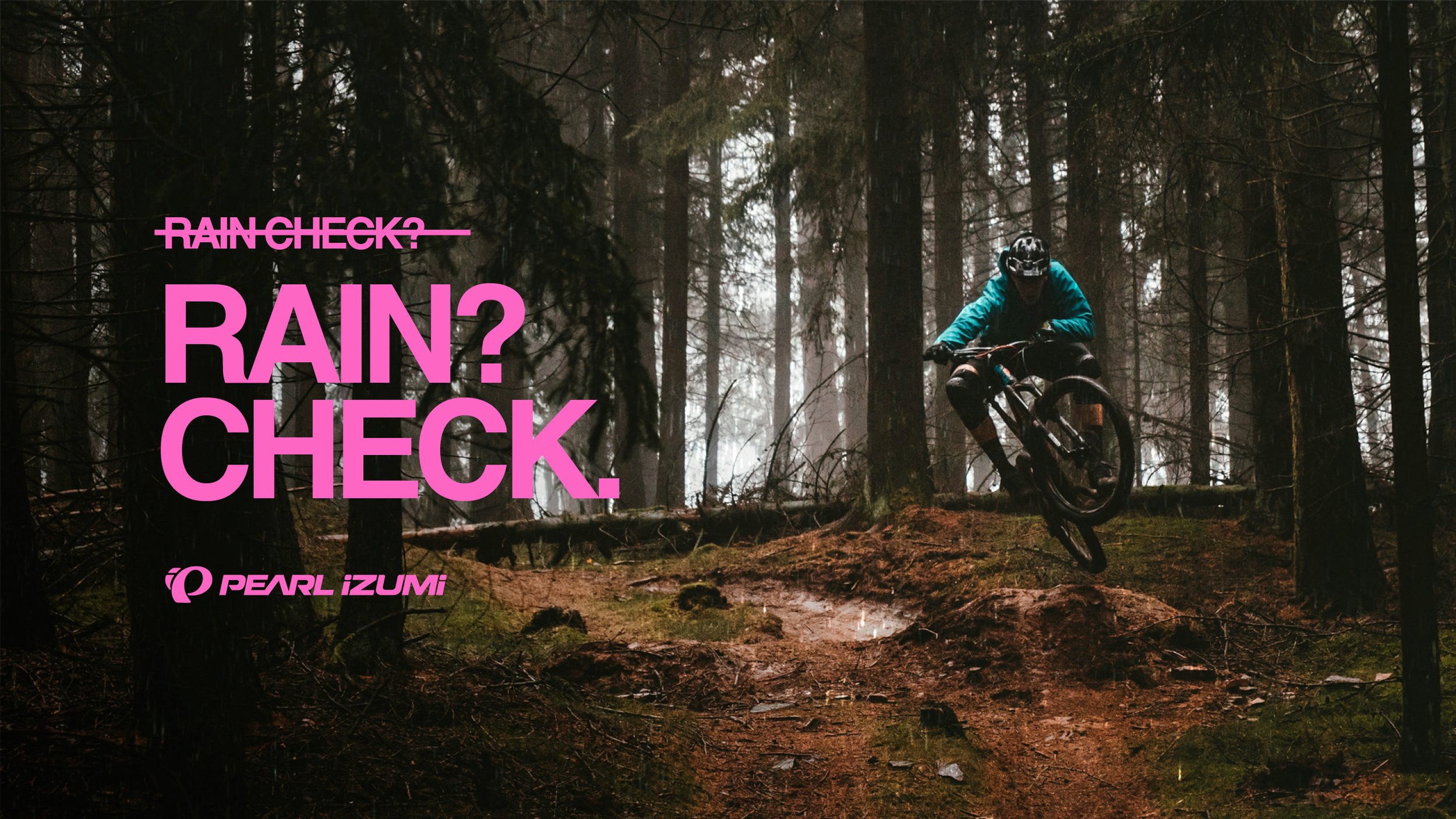
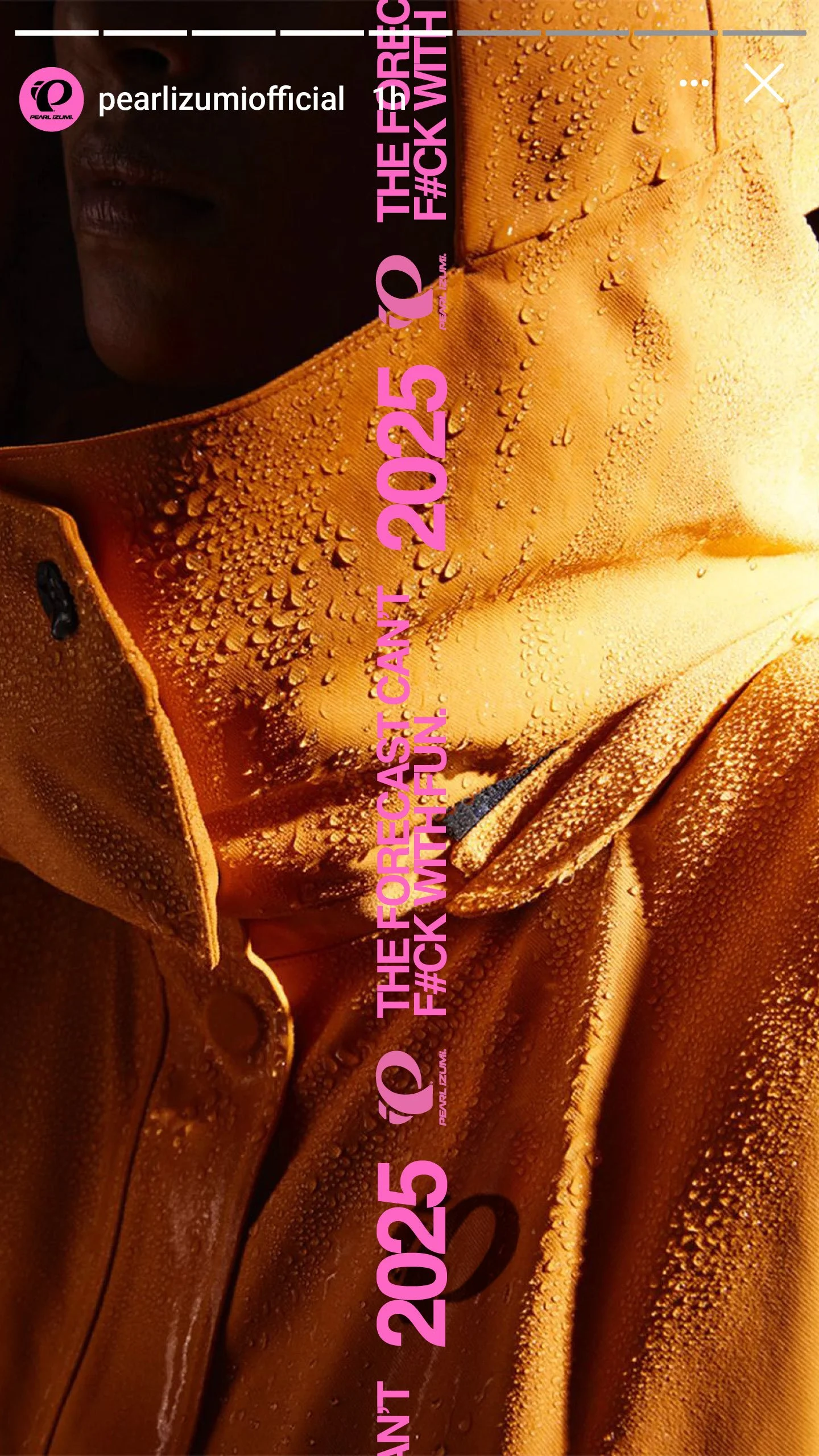
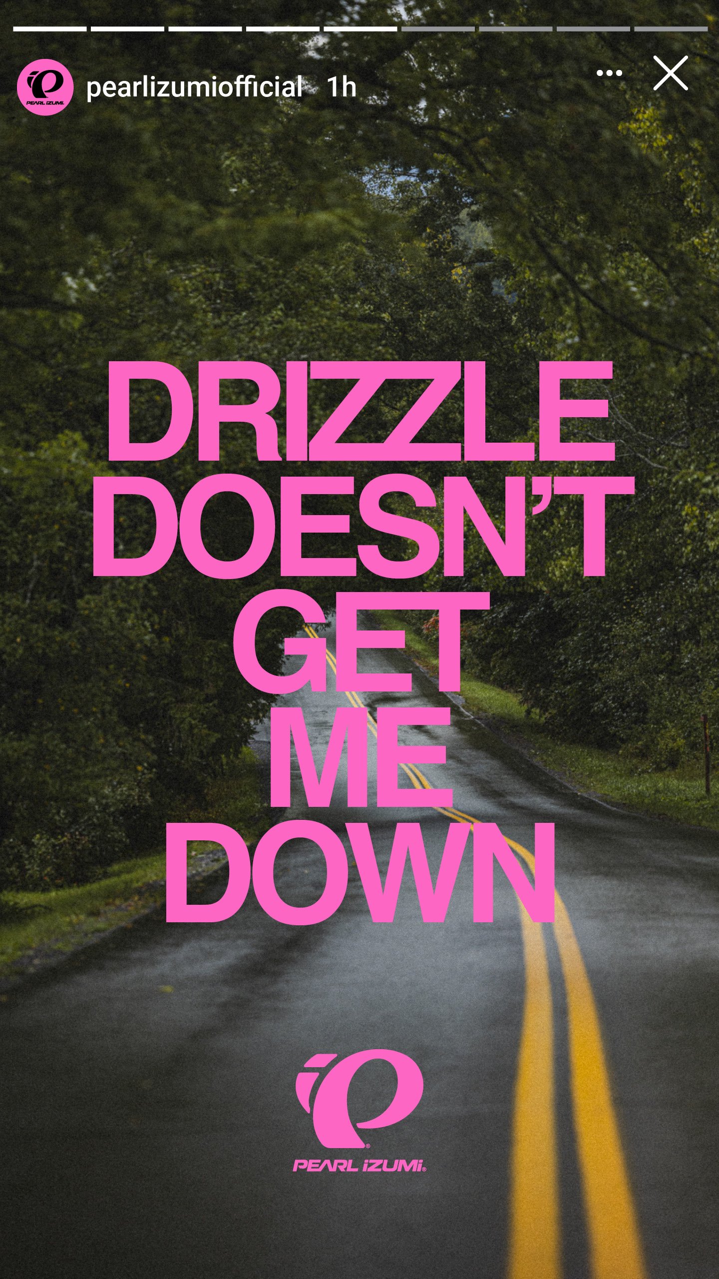
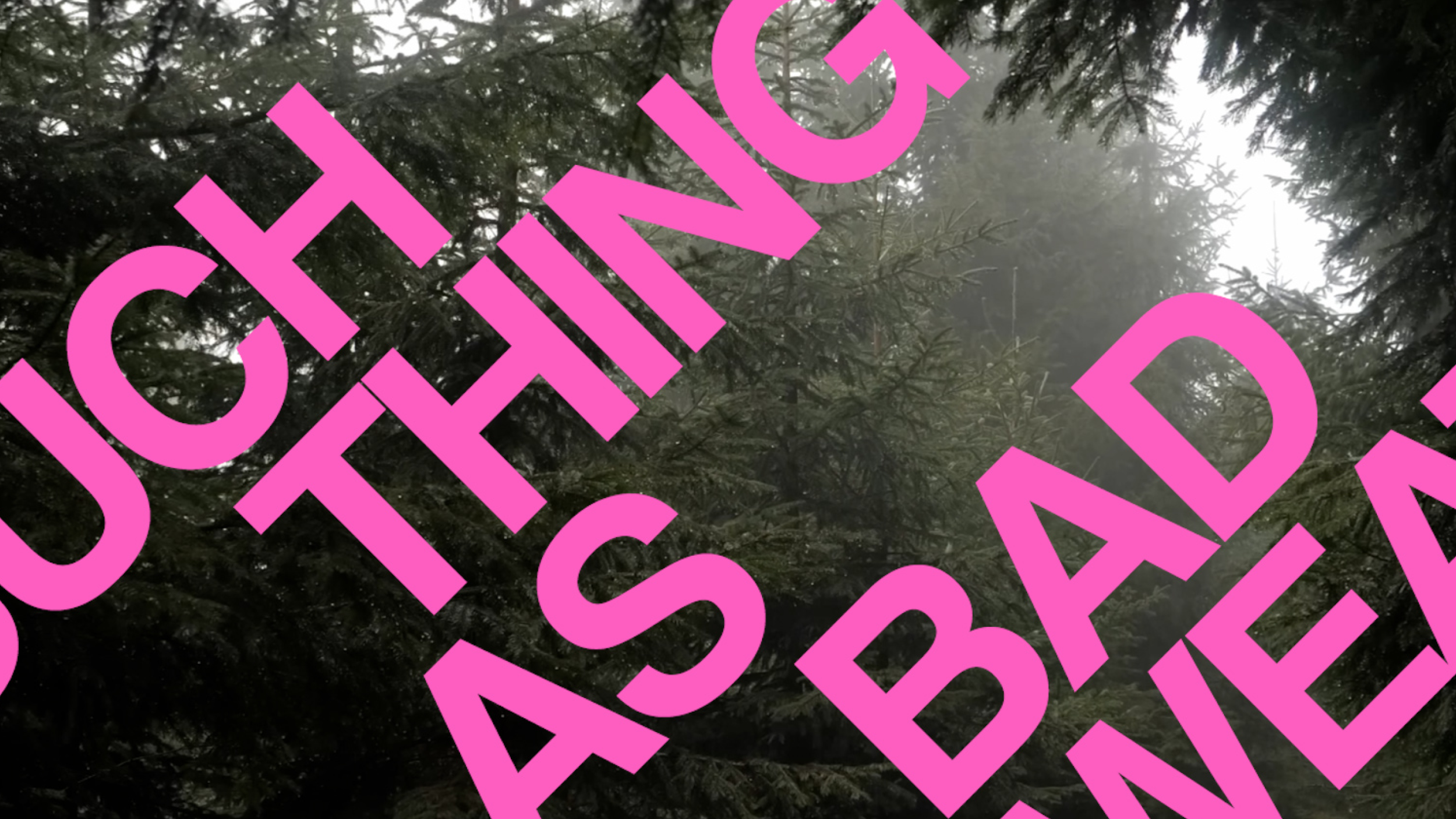
We set the type system to be the loudest thing in every frame, oversized, structural, weather-proof at a glance. Type is not sitting on the layout here, it is the layout, scaled to hold a headline on a jersey hangtag and a billboard with the same swagger and read clean from a car doing forty in the rain.
Color
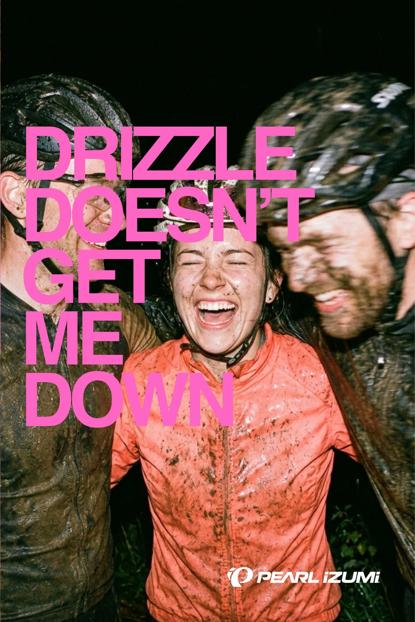
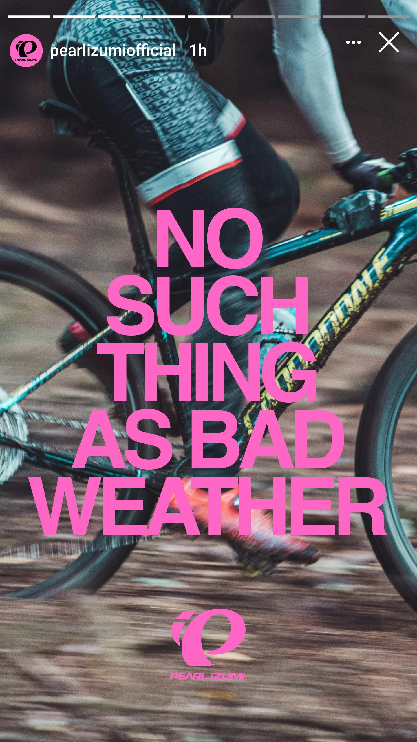
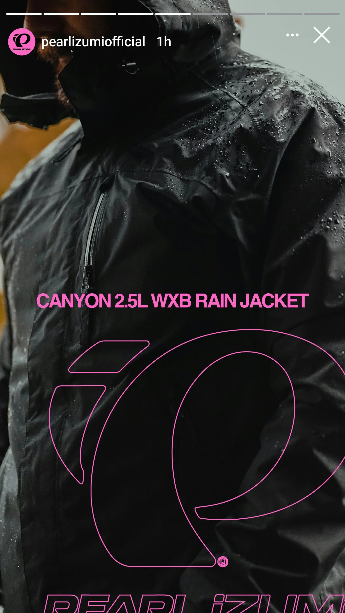
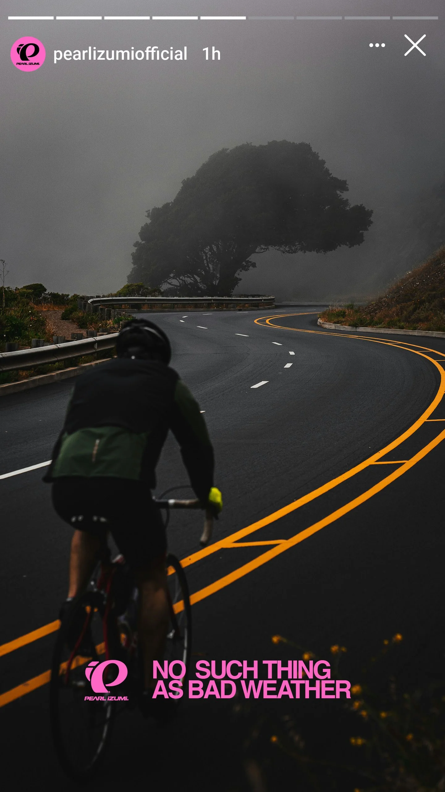
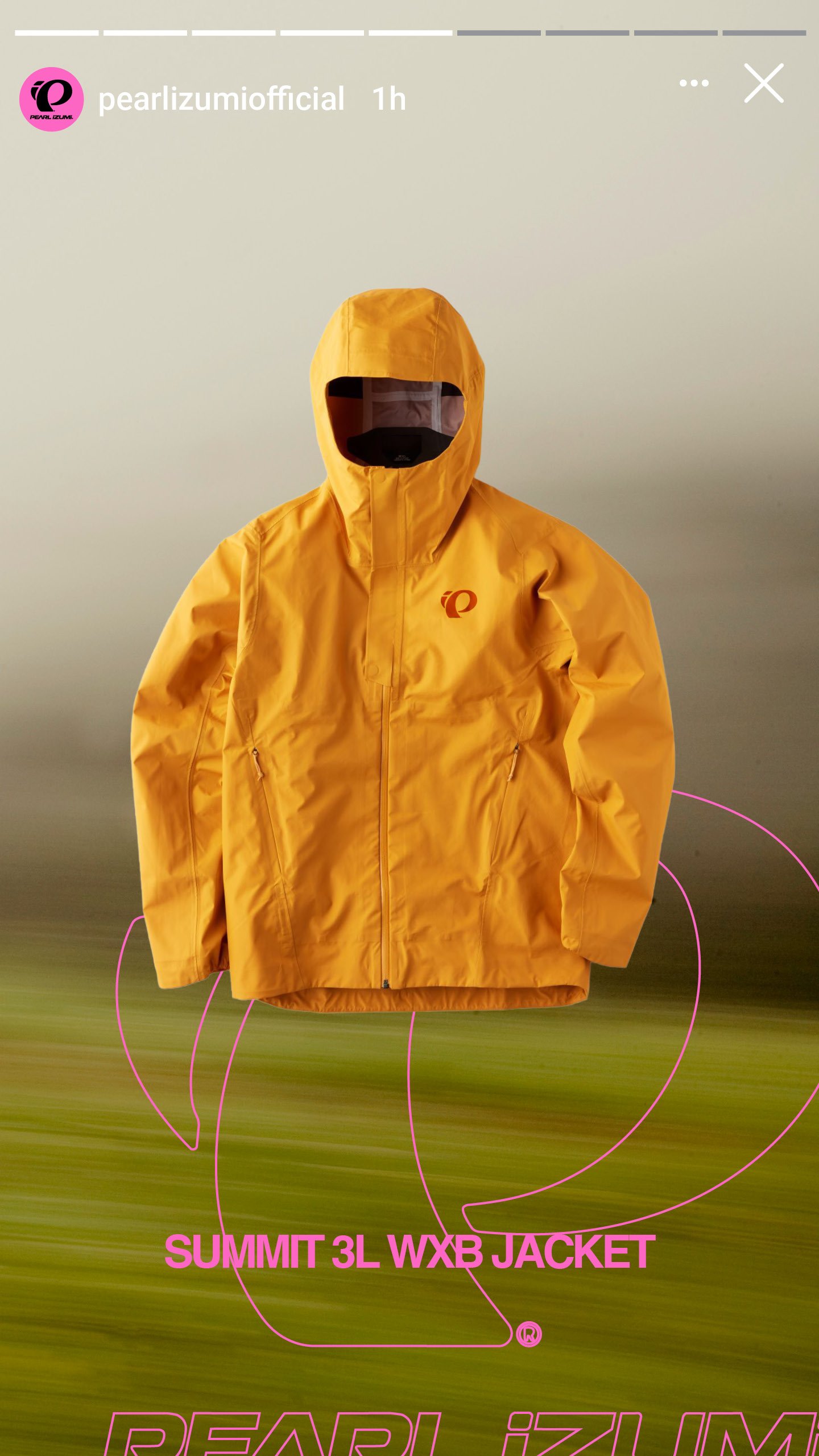
Hot pink against black skies and soaked pavement, joy made structural. In a feed of grey and grim it is the one thing that refuses the mood of the season, a color you cannot ride past without registering it. Loud on purpose, and impossible to mistake for anyone else.
Motion
The primary voice ran in motion, pink text on black, the line landing in sequence so the joke and the dare arrive on beat. Motion carried the message anywhere the campaign moved, homepage, paid social, retargeting, the same grin in every cut.
Photography
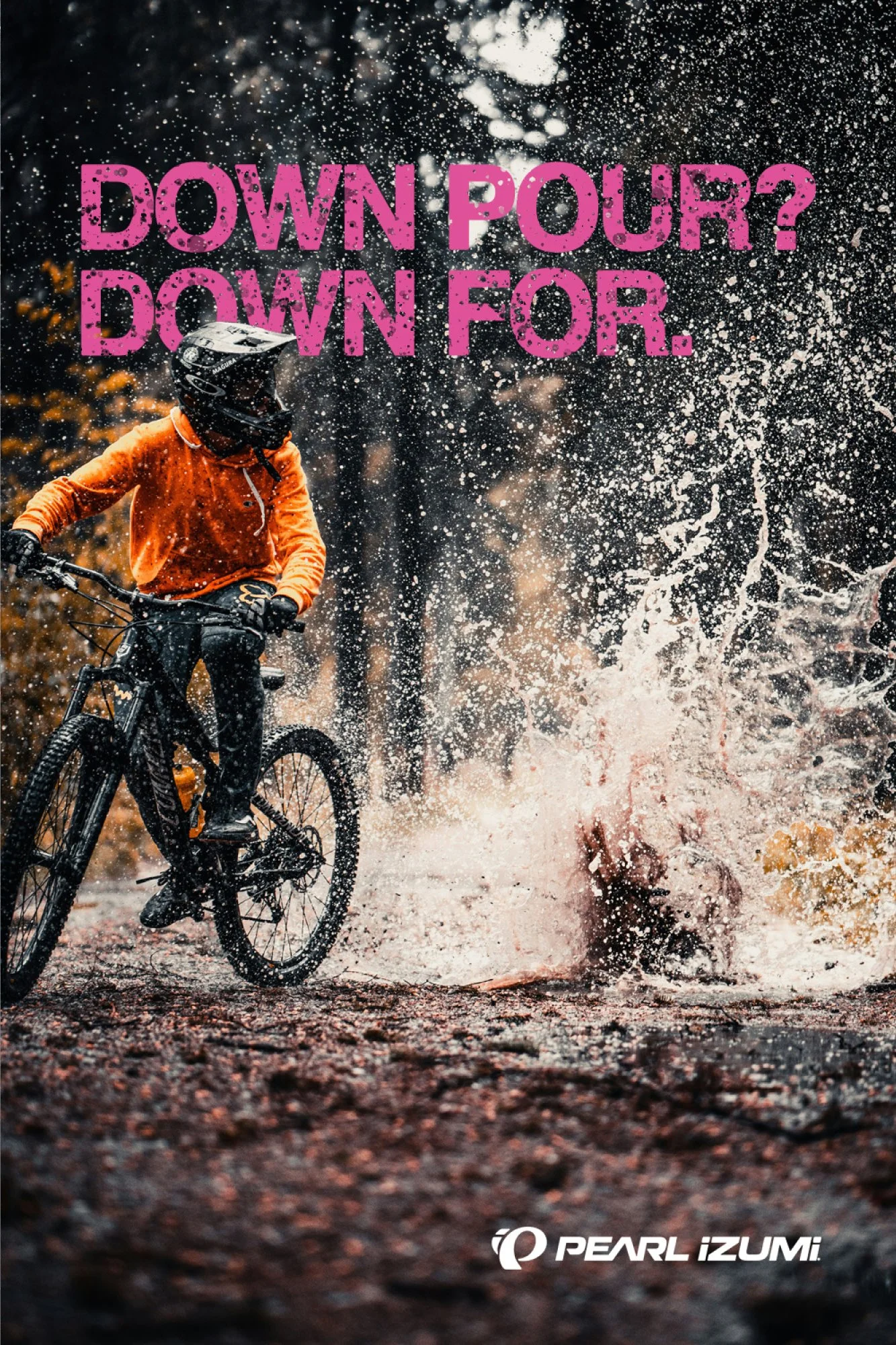
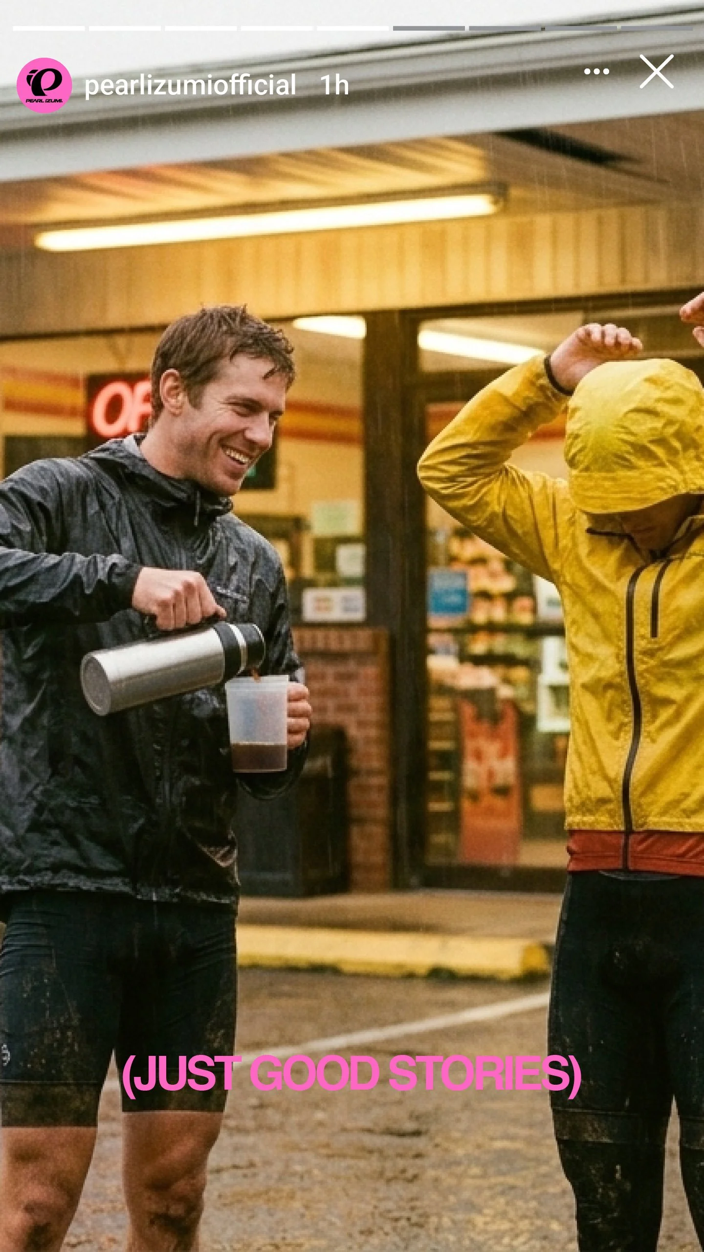
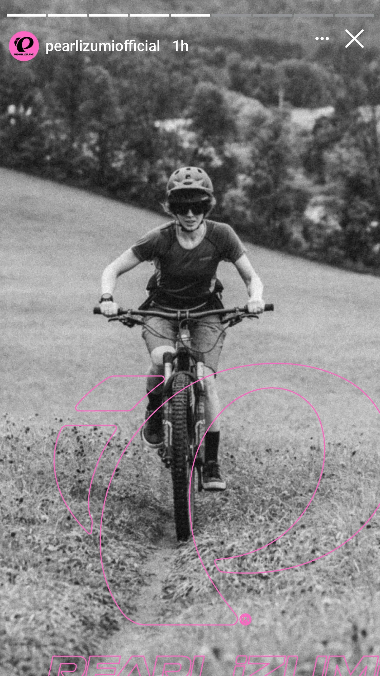
We art-directed across owned and stock photography, choosing frames where the rider is grinning through it rather than gritting against it. The weather stays real, wet, cold, unglamorous, but the face flips the whole genre. Same storm every rival shoots, opposite emotion.
Design System
One kit, built to hold the idea at every size and stage of the season. Print supported retail and out of home, digital ran across the homepage, campaign landing pages, organic and paid social, and Google and retargeting ads, and templated social kept the voice intact as volume scaled. The loud pink idea survives the jump from a store window to a six-second ad without ever going quiet.